Mr. Lube Prototype
Status: Currently under consideration by Mr. Lube
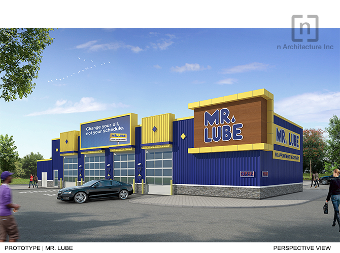
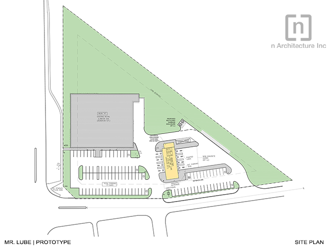
n Architecture Inc. was commissioned by a Mr. Lube Franchisee to design an architectural prototype for the Mr. Lube Store. The design intent is to construct a new prototypical building that would accommodate vehicle maintenance servicing, while re-designing the Mr. Lube stores with a vibrant outlook.
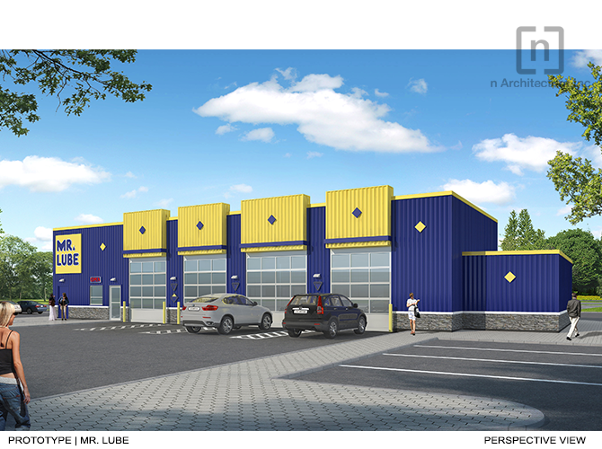
The architectural colour palette of the structure proposes a new dynamic identity of Mr. Lube. The two primary colours yellow and blue represent an interesting colour contrast to create an energetic space that is welcoming to visitors. Blue transmits the feeling of positivity, confidence, and security. It is often used in commercial and business spaces. Yellow portrays optimism, curiosity, and cheerfulness. Using two fundamental colours as the basis of our design, we are able to visually communicate with pedestrians and customers through transparent, simple, and open dialogue. This proposal is intended as a standard prototype of Mr. Lube, and the colour selection reflects Mr. Lube’s signature logo and branding.
The material selected for the structure is insulated metal panels. The panels provide a seamless exterior and a lively elevation through vibrant silver finishing. Not only is there versatility in the installation of these panels for creative ambition, but the material also ensures efficiency through reduced installation time. Since this is a proposal for future development, sustainability is a priority for regenerative environmental development.
The structure is able to create an open dialogue with its visitors through visually aesthetic elements and design fluidity. The spatial concept of the proposed prototypical building presents a predominantly open, bright and customer-friendly architectural style. The service space is illuminated by natural light via a front glass facade and by artificial lighting though architectonic designed ceiling fixtures.


